Summary
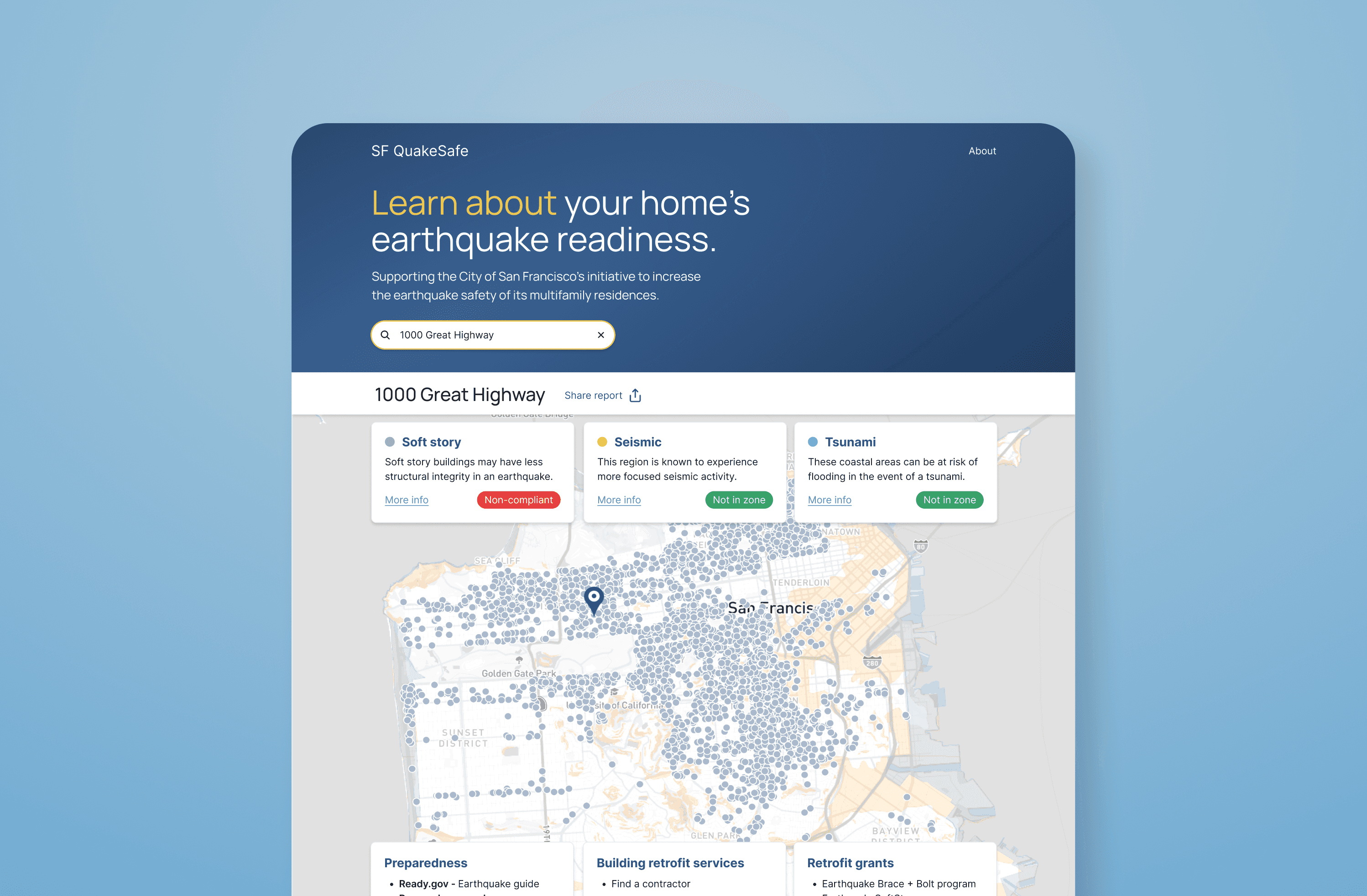
Our research revealed San Francisco residents’ want for earthquake safety information and resources. After iteration and testing, and working with the team of engineers and data people, I organized a dashboard providing building and area safety information, supported by a safety-zoned navigable map of San Francisco and earthquake safety resources. Now in testing for usability, visual design, and to reaffirm the initial concept before final iteration and release of MVP.
The team
Product Designer (my role)
2 Product Managers
2 Front-End Developers
3 Back-End Developers
2 Data Scientists
Occasional research help
The problem
A large number of San Francisco homes are not structurally prepared for earthquakes, and specifying data is not easily accessible to the public.
Our intended users
All who pay to live in San Francisco, and those considering it.
Initial research to discover key functions
While the original scope was to make local earthquake safety data accessibly available, we wanted to check user needs and to validate the idea. Due to budget constraints exploratory research was confined to surveys, with around 50 respondents, confirming the need for the original idea while also surfacing these priorities:
Care when addressing earthquake safety concerns, as the topic surfaced existential wariness in users
Address lookup with building, liquefaction, and tsunami safety information
General earthquake preparedness resources, including escape plans and household preparedness
Browsable earthquake safety map of San Francisco
Ability to share building safety report
Information on the project and its data sources
Competitive analysis revealed some similar tools targeted at more technical users, while also highlighting the need for an accessible option unified with preparedness resources.
Interface formats considered
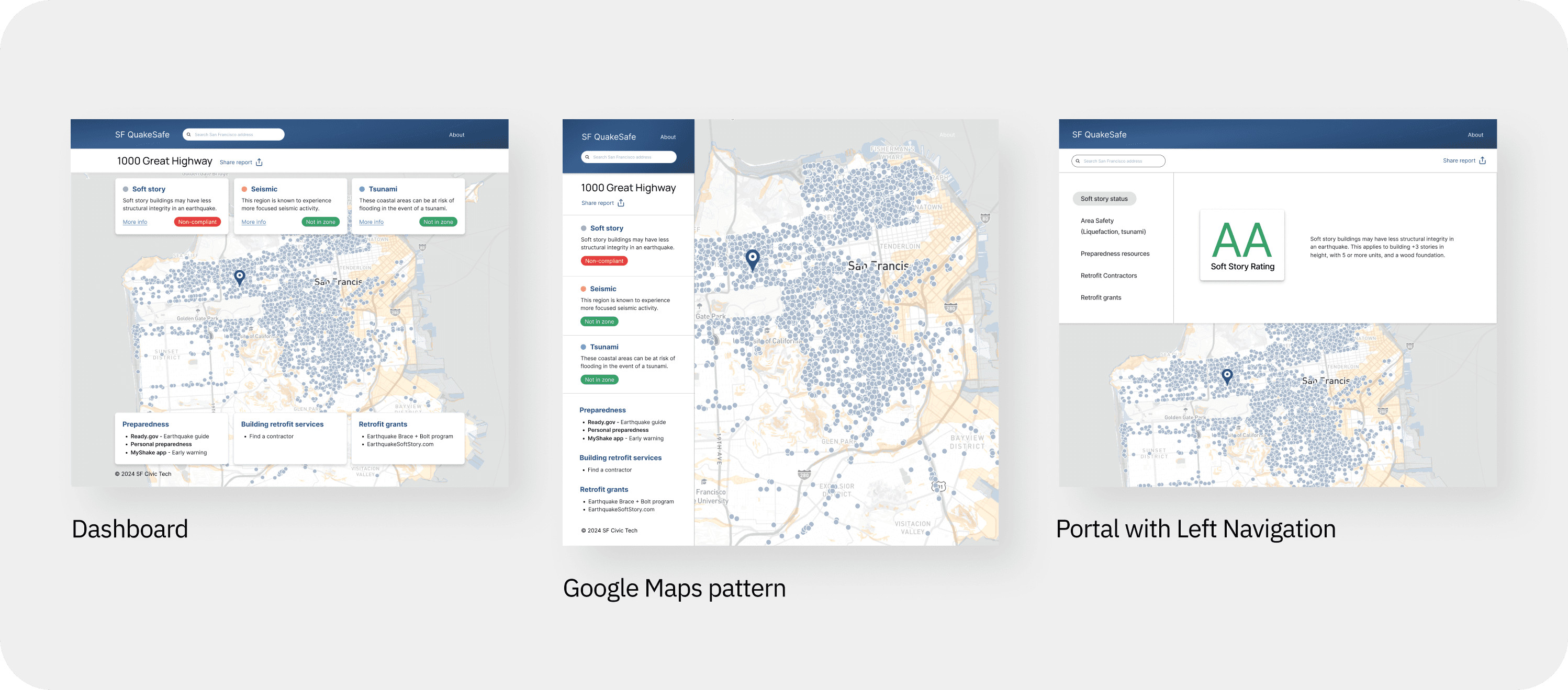
Given the user priorities, I considered several archetypal layouts:
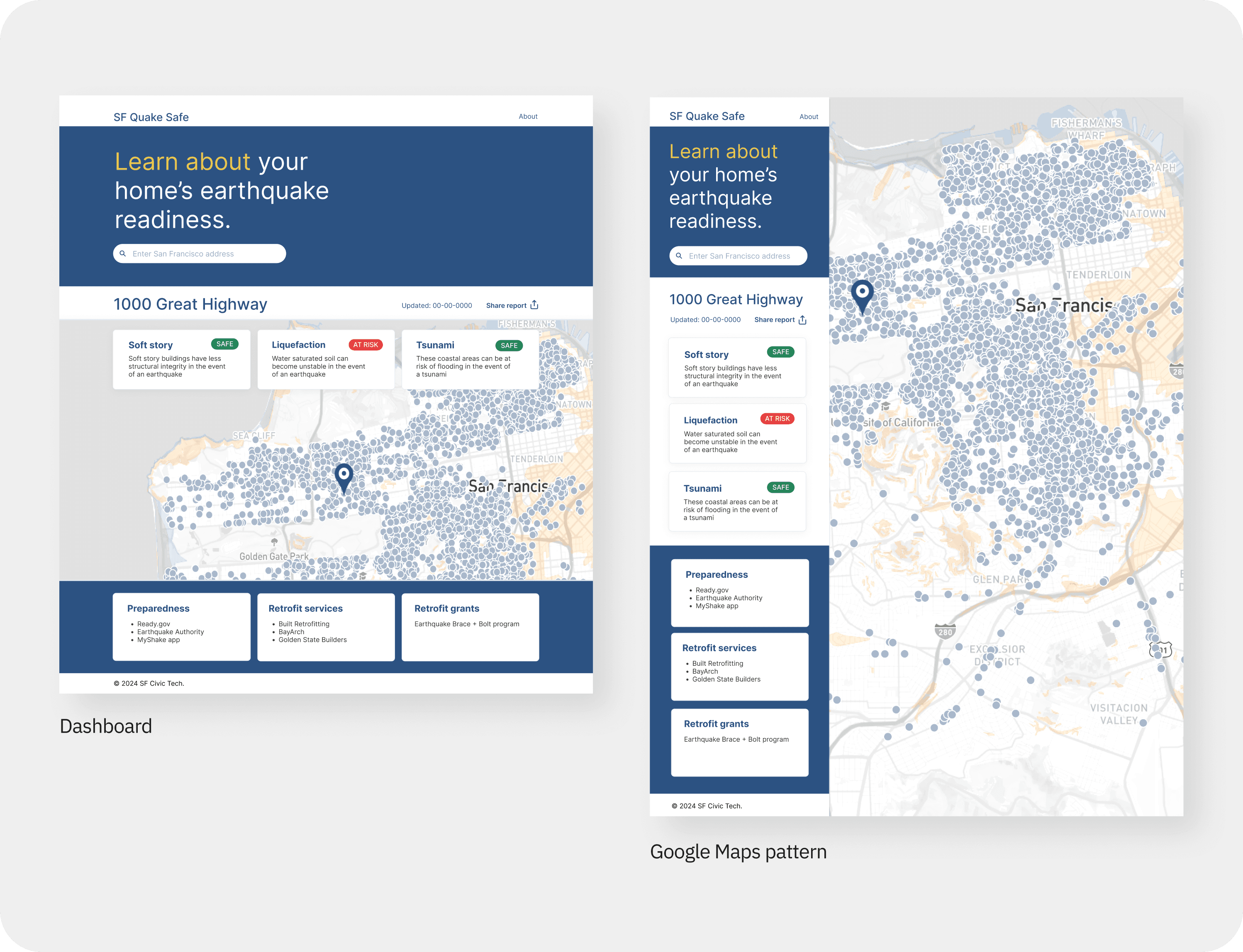
Dashboard: data clearly displayed
Google Maps pattern: due to user familiarity
Portal with Left Navigation: allowing for dedicated pages per data type
Chosen
Dashboard: A single-pane responsive web dashboard was chosen because it would be easily accessible to all devices and user types (including those with screen readers), while also providing an authoritative single-glance report after address lookup.
Not Chosen
The Google Maps pattern is focused around the map, which was decided against as the map was deemed to be secondary to the hazard data and resources, based on the discovered user needs.
Portal with Left Navigation was decided against since it would require additional interaction to use, possibly posing difficulty for those with screen readers and the less computer literate.
Defining user flows
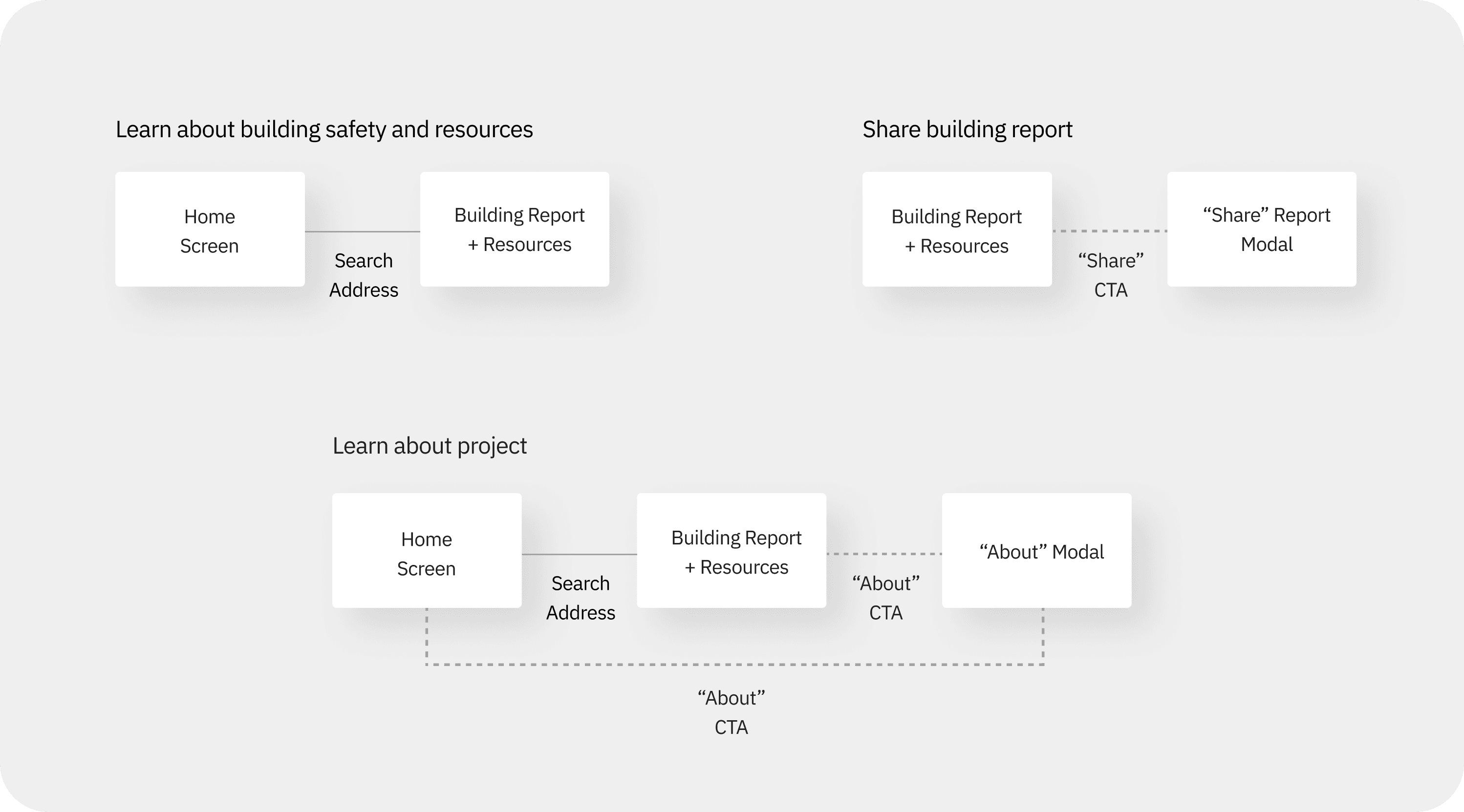
Once a layout was decided on, I mapped simple ways for users to meet their needs.
Finding necessary screens
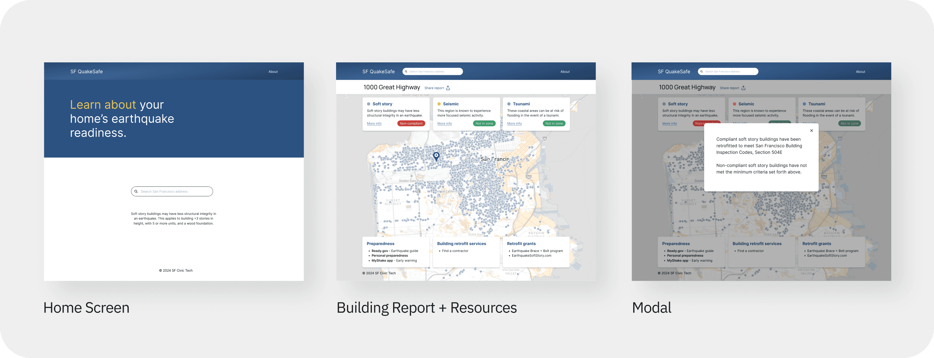
Based on the user flows, three screen modes were identified as necessary:
Home Screen: address lookup and branding
Building Report and Resources (dashboard)
Modals: supporting information
Layout iteration and testing
A concern from the data science side was that the two-page design did not allow users to immediately browse the safety map without entering an address, prompting redesign to a single page
Interest in the Google Maps pattern also resurfaced from the engineering side, prompting A/B testing, which confirmed the Dashboard as the preferred format
Visual refinement and data transparency
A concern regarding liability surfaced during initial research led me to want to contact the City of San Francisco to ensure the interface and alert language were transparent to the intent in the City's dataset, on which the project is based. A meeting with City representatives allowed us to redefine the alert language to be in accordance with the City's intent, and also to provide users with details on how safety is being judged by the City.
Additionally, a second exploration on the visual design layer, based on user research, allowed us to land on a more refined look-and-feel to better engage the audience.
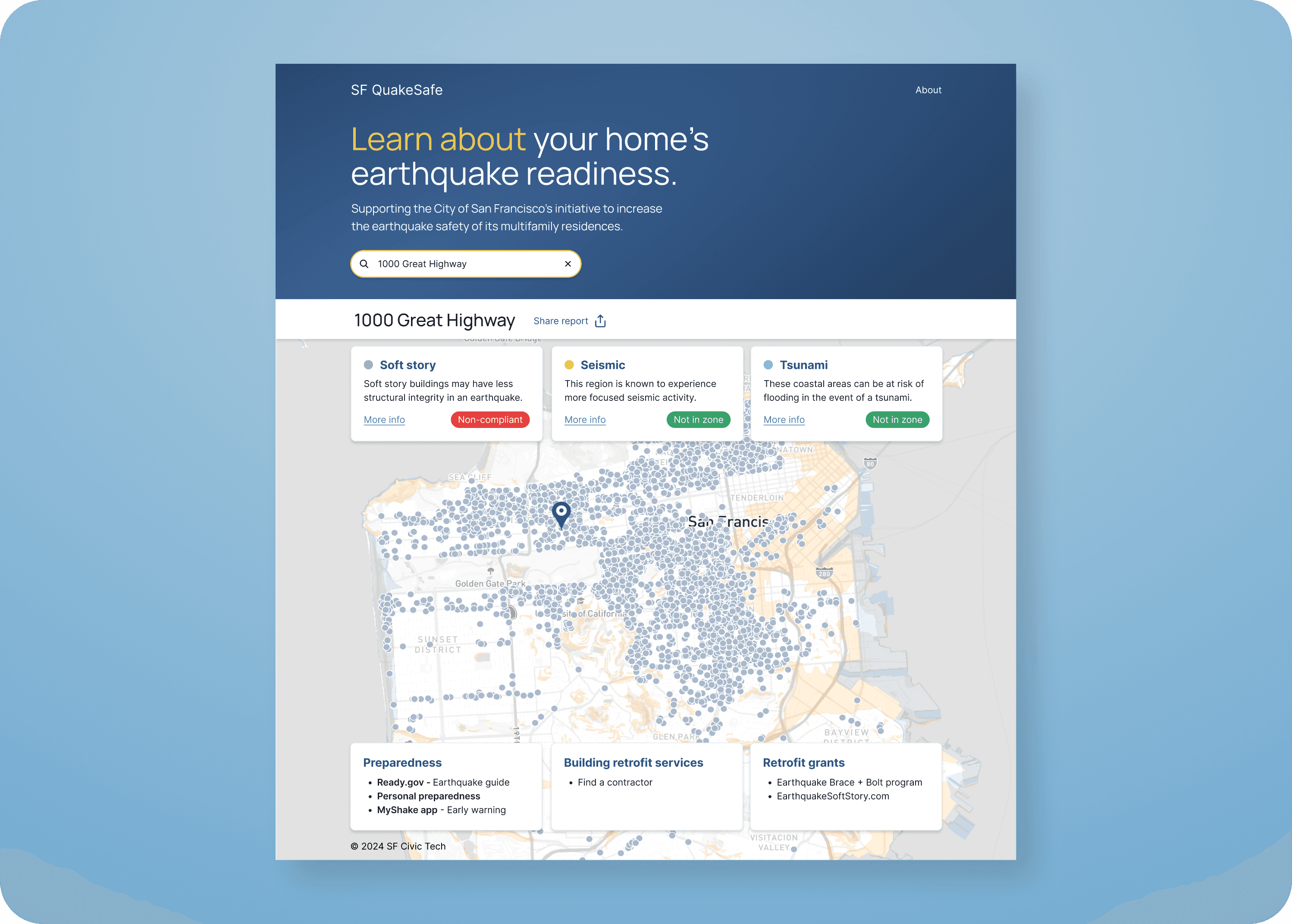
Currently testing usability, visual design, and concept
In collaboration with the team, I designed a script to guide testing for usability, visual design feedback, and to revalidate the concept with San Francisco residents over Zoom. A pilot test allowed further refinement of the testing script and materials.
Once testing is completed, we will analyze feedback to inform next steps, iterate on the design, and share the designs with the front-end engineers so they can complete their build. A continuing relationship with City officials could possibly lead to their endorsement of the project.
Next steps
Address any legibility and accessibility concerns on map and dashboard panels
Create dedicated About page to allow for increasing volume of information
Address language clarity concerns
Legal pass and disclosure writing
Continue collaboration with City of San Francisco once initial product is live
Consider direct mailing addresses in need of retrofit with website details
Analytics to monitor success and guide evolution
